How to create modal popup using Lightning Web Components
Salesforce Lightning Experience: Modal
- Modals and popup boxes are used to display content in a layer above the app. This is used in cases such as the creation or editing of a record, as well as various types of messaging and wizards.
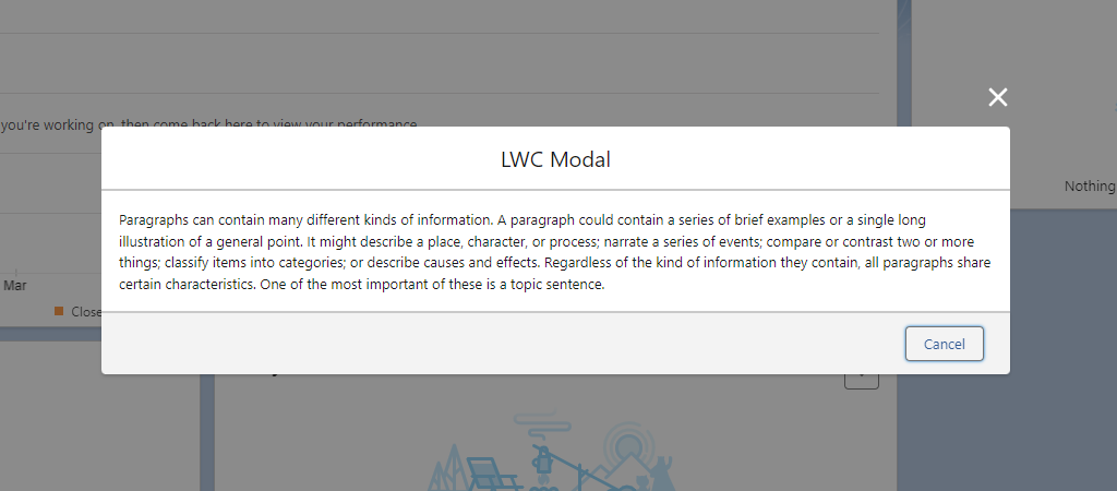
Modal/Popup using LWC in Salesforce looks like following image
modalLWC.js
- LightningModal provides an .open() method that opens a modal and returns a promise that asynchronously resolves with the result of the user’s interaction with the modal.
- The .open() method lets you assign values to the modal’s properties. LightningModal provides these properties.
- label
- size
- description
- disableClose
import { LightningElement } from 'lwc';

import MyModal from 'c/myModal';

export default class modalLWC extends LightningElement {

                    async handleClick(){

                        const result = await MyModal.open({

                            size: 'small',

                        });

                    }

}
modalLWC.html
The HTML template for this app contains a button that opens the modal.
<template>

                    <lightning-card title="Show Hide Modal Demo">

                        <lightning-button

                        class="slds-p-left_x-large"


                        onclick={handleClick}

                        label="Open My Modal"

                             ></lightning-button>

                    </lightning-card>
myModal.js
- To create a modal component, import LightningModal from lightning/modal.
- The component has access to the methods, and events of the lightning/modal module.
import LightningModal from 'lightning/modal';

export default class MyModal extends LightningModal {
}
myModal.html
- This HTML template contains the modal header, body and footer.
<template>

                    <lightning-modal-header label="LWC Modal"

        ></lightning-modal-header>

                    <lightning-modal-body>

                        <p>     <!-- Enter your Content Here -->      </p>

                    </lightning-modal-body>

                <lightning-modal-footer>

                        <lightning-button

                        variant="neutral"

                        label="Cancel"

                   onclick={handleCancel}

                class="slds-p-right_x-small"

                        ></lightning-button>

              </lightning-modal-footer>

        </template>